04. Phase curve fit analysis (Intermediate)#
Contact authors: Yumi Choi and Melissa Graham
Last verified to run: 2023-12-22; updated to reflect the new UI starting May 6 2024
Targeted learning level: Intermediate
Credits: This tutorial incorporates material from the DP0.3 tutorial notebook on the introduction to phase curves by Christina Williams and Yumi Choi.
Introduction#
This portal tutorial illustrates the phase curves of solar system objects with a focus on Main Belt Asteroids (MBAs).
Phase curve fits and absolute magnitudes#
Solar system objects in the DP0.3 catalogs change position and brightness between each Rubin image as they orbit about the Sun over time. In the DP0.3 catalogs, their intrinsic properties and orbital parameters are known, and are used to estimate what the measurements would be in a given image, and how they change between images. From these simulated observations, it is possible to reconstruct their intrinsic properties and orbital parameters in the same way as will be done using the real LSST data.
An important way to characterize intrinsic properties of a solar system object is by measuring its “phase curve”,
which is the object brightness as a function of its “solar phase angle” (the angle made between the line of sight
from the object to the Sun, and the line of sight from the object to Earth). For Solar System objects, absolute
magnitudes (H) are defined to be for an object 1 au from the Sun and 1 au from the observer, and at a phase
angle \(\alpha\) (the angle Sun-object-Earth) of 0 degrees. Absolute magnitudes are derived by fitting a
function to the relationship between reduced magnitude \(H(\alpha)\) and phase angle \(\alpha\)
(i.e., the phase curve), and evaluating the function at a phase angle of 0 degrees. The reduced magnitude,
which is corrected for distance, \(H(\alpha)\), is:
where \(\alpha\) is the phase angle, \(d_{t}\) is the topocentric distance,
\(d_{h}\) is the heliocentric distance, and m is the apparent magnitude.
The absolute magnitude H can be derived by fitting a function, where the choice of
form for this function has several options
(see Muinonen et al. 2010).
The simple two-parameter model (HG model) for asteroids provides a best fit for the absolute magnitude H and
the slope parameter G. The HG model parameters were used to predict the observed parameters for each object.
These truth values are defined in the MPCORB table as mpcH (intrinsic absolute magnitude in V band) and
mpcG (intrinsic slope, which has a constant value of 0.15 for all DP0.3 objects). The HG model has the form:
To better accommodate various observational effects (e.g., photometric quality, incomplete phase angle sampling)
a more sophisticated HG1G2 model (a linear three-parameter function) and its nonlinear two-parameter version
HG12 model were developed (Muinonen et al. 2010).
The two-parameter HG12 model is generally very effective for deriving reliable values of absolute magnitude when
the phase angle sampling is not optimal (e.g., poor phase angle coverage at a range of phase angle). Thus, the LSST
data products will compute estimated parameters of the HG12 model and this will be the focus of this tutorial.
The HG12 model expresses the G1 and G2 parameters as a piecewise linear function of a single parameter, G12:
where:
\(G1 = 0.9529 \times G12 + 0.02162\), \(G2 = -0.6125 \times G12 + 0.5572\) for \(G12 \ge 0.2\), and \(G1 = 0.7527 \times G12 + 0.06164\), \(G2 = -0.9612 \times G12 + 0.6270\) for \(G12 < 0.2\).
The results of phase curve fits (H and G12) in the four LSST filters, griz, are stored in the SSObject table.
The explanation for the absence of u and y bands in DP0.3 catalogs can be found in the DP0.3 documentation.
Note that rotation curves or complex geometry of solar system objects are not included in DP0.3 simulations.
Thus, any changes over time in an object’s apparent magnitude are due only to changes in its distance and phase angle.
Step 1. Query the DP0.3 tables for the Main Belt Asteroids#
1.1. Log into the Rubin Science Platform at data.lsst.cloud and select the Portal Aspect. On top, select the “DP0.3 Catalogs” tab.
1.2. At upper right, next to “View” choose “Edit ADQL”. Enter the query statement below into the ADQL Query box and
execute the query to select a good number of MBAs with a fair number of total observations (numObs > 100)
to explore the distribution of their properties. Following the population definitions used by the
JPL Horizons small body database query tool, we select MBAs
as objects with semi-major axes a between 2.0 au and 3.25 au and perihelion distance q > 1.666 au.
Note that semi-major axes are not directly available in the MPCORB table, so the constraint
on a is derived from perihelion q and eccentricity e. You might want to increase the “Row limit” to
100,000 to have an appreciable sample of objects by entering this number in the box on the lower left.
In order to have the query execution not to take too long, we restrict the number of returned objects to have their
mpc.ssObjectId in the limited range.
SELECT mpc.ssObjectId, mpc.e, mpc.q, mpc.mpcG, mpcH,
sso.numObs,
sso.g_H, sso.g_Herr, sso.g_G12, sso.g_G12err, sso.g_Ndata,
sso.r_H, sso.r_Herr, sso.r_G12, sso.r_G12err, sso.r_Ndata,
sso.i_H, sso.i_Herr, sso.i_G12, sso.i_G12err, sso.i_Ndata,
sso.z_H, sso.z_Herr, sso.z_G12, sso.z_G12err, sso.z_Ndata
FROM dp03_catalogs_10yr.MPCORB as mpc
JOIN dp03_catalogs_10yr.SSObject as sso
ON mpc.ssObjectId = sso.ssObjectId
WHERE mpc.ssObjectId < 9223370875126069107
AND mpc.ssObjectId > 7331137166374808576
AND (mpc.q / (1-mpc.e)) > 2.0
AND (mpc.q / (1-mpc.e)) < 3.25
AND (mpc.q > 1.666)
AND sso.numObs > 100
1.3. Plot the distribution of semi-major axes a of orbits of the objects in your query. Select the “Active Chart” tab on the panel containing the plot.
(You can chose to have the plot to appear on the left or the right side of your window - this can be changed by clicking the
“hamburger” icon on the upper left corner of the Portal screen, and selecting the layout of your choice in the “Results Layout” tab.)
The execution of the query will result in a blank panel for the plot, with a comment “Cannot display the requested data.”
To plot the distribution of a you need to add another plot panel by clicking on the “+” button on the upper left side of the plot window.
In the new window, select “Histogram” for “Plot Type”, enter “q / (1-e)” as the “Column or expression” and “100” for number of bins as on the screenshot below.
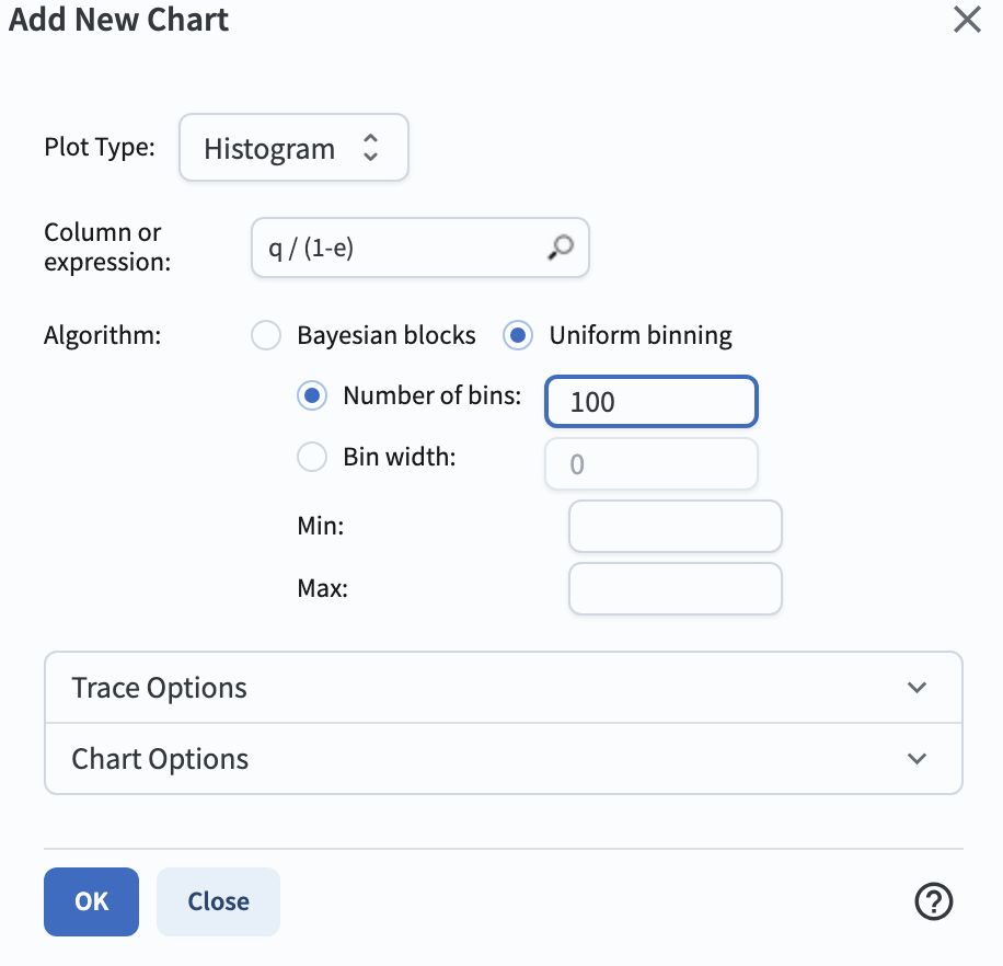
Figure 1: The “Plot Parameters” pop-up window to set parameters for making a histogram of semi-major axes for MBAs.#
1.4. Click “OK” in the pop-up window. Also, close the chart stating “cannot display requested data” by clicking the blue “X” mark in its upper right hand corner. It will result in the following plot and table below. Note that the distribution of asteroids as a function of semi-major axis is not uniform, but it reveals a number of peaks and gaps where there are very few (or no) objects. These are known as Kirkwood gaps, which arise due to resonances between the asteroid’s and Jupiter’s orbital periods.
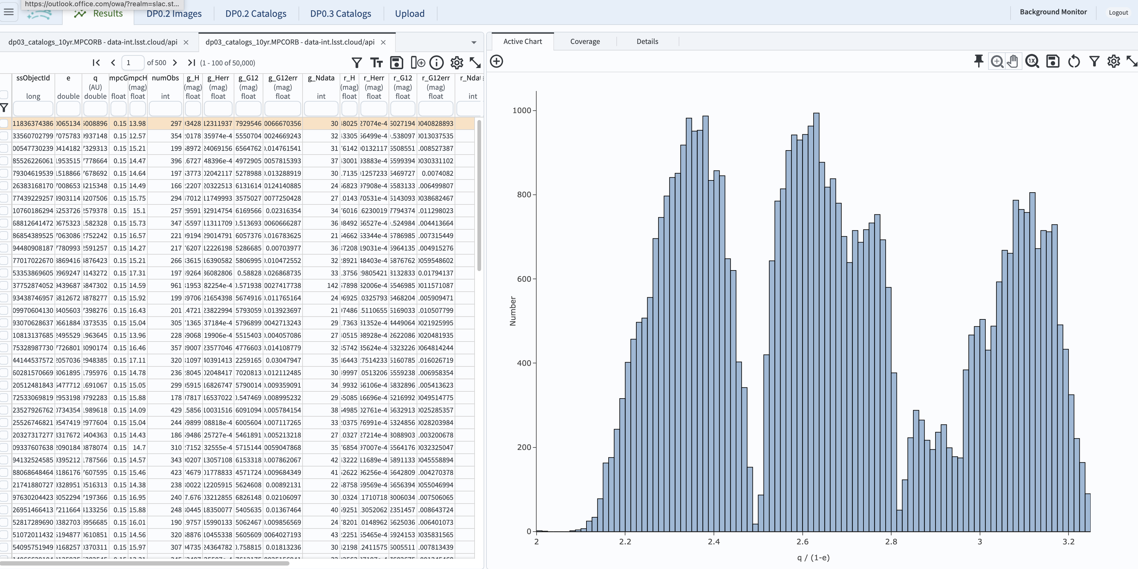
Figure 2: The distribution of semi-major axes for MBAs. The prominent Kirkwood gaps in this plot are located at 2.065 au (4:1 resonance), 2.502 au (3:1 resonance), 2.825 au (5:2 resonance), and 2.958 au (7:3 resonance).#
Step 2. Select a well-observed MBA, and plot its phase curve#
2.1. Unique solar system objects in the SSObject and MPCORB tables will be observed many times over the full LSST survey.
Individual observations of each unique object in each filter are recorded in the SSSource and diaSource tables.
Below, we query these tables to obtain all of the individual observed time series data (we call indivObs) for an MBA that has
more than 2000 observations. First, in the Table resulting from the last search in Step 1, select MBAs with 2000 or more
observations by entering “>2000” in the box underneath the table heading numObs as shown as below and hitting the return key.
This will leave only a small fraction of queried 100,000 MBAs above, 23 MBAs in this tutorial.
To go back to the originally retrieved table by removing the applied filter, click the remove filter icon, which is the first icon on the top
right of the table.
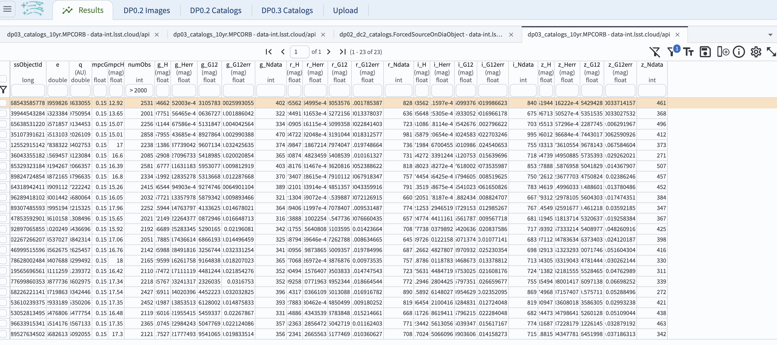
Figure 3: The resulting table of 23 MBAs with 2000 or more observations out of the retrieved 100,000 MBAs in Step 1.2.#
2.2. Pick and copy one ssObjectId. Hovering over a table cell shows you a triple-dot box. Click on that box,
two options will pop up: “Copy to clipboard” and “View as plain text”. Here, copy ssObjectId = 7470575696289418102
to clipboard.
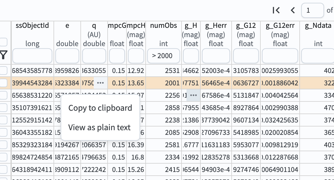
Figure 4: How to copy a selected ssObjectId to clipboard.#
2.3. Return to the page where you can select the “DP0.3 Catalogs” by refreshing your browser, and select it. Click on the “Edit ADQL” tab. Execute the following ADQL query to retrieve the apparent magnitudes, magnitude errors, filters, phase angles, topocentric and heliocentric distances of the individual observations for a well-observed MBA.
SELECT
dia.ssObjectId, dia.mag, dia.magErr, dia.band,
sss.phaseAngle, sss.topocentricDist, sss.heliocentricDist
FROM dp03_catalogs_10yr.DiaSource as dia
INNER JOIN dp03_catalogs_10yr.SSSource as sss ON dia.diaSourceId = sss.diaSourceId
WHERE dia.ssObjectId = 7470575696289418102
2.4. The default plot is the first column of the table in X-axis, and the second column in Y-axis - not very useful.
To plot the phase curve in the g-band (i.e, reduced magnitude versus phase angle), first select the g-band
data by clicking on the down-arrow in the box underneath the table heading band checking the box by the “g” entry (see the Figure below Step 2.5).
Then open the “Plot Parameters” pop-up window (click on the single gear icon), click on “Modify Trace”, set the “X” to phaseAngle
and “Y” to mag - 5 * log10(topocentricDist * heliocentricDist). Check the “Error” box for the y-axis and select
“Symm”, and put magErr. Click on the “Chart Options” arrow, and set the “X Label” to be “Phase angle (deg)” and the “Y Label”
to be “Reduced g magnitude”. Check the “reverse” box for the y-axis option.
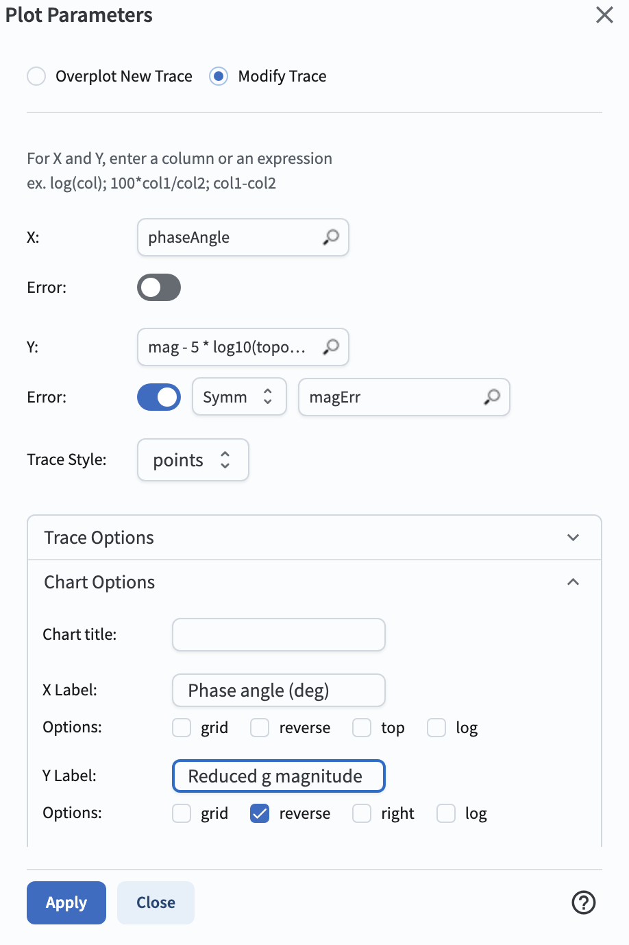
Figure 5: The “Plot Parameters” pop-up window to plot the phase curve in g-band.#
2.5. Click on the “Apply” button. This will result in the g-band phase curve plot with error bars for the MBA with
ssObjectId = 7470575696289418102 as shown below.
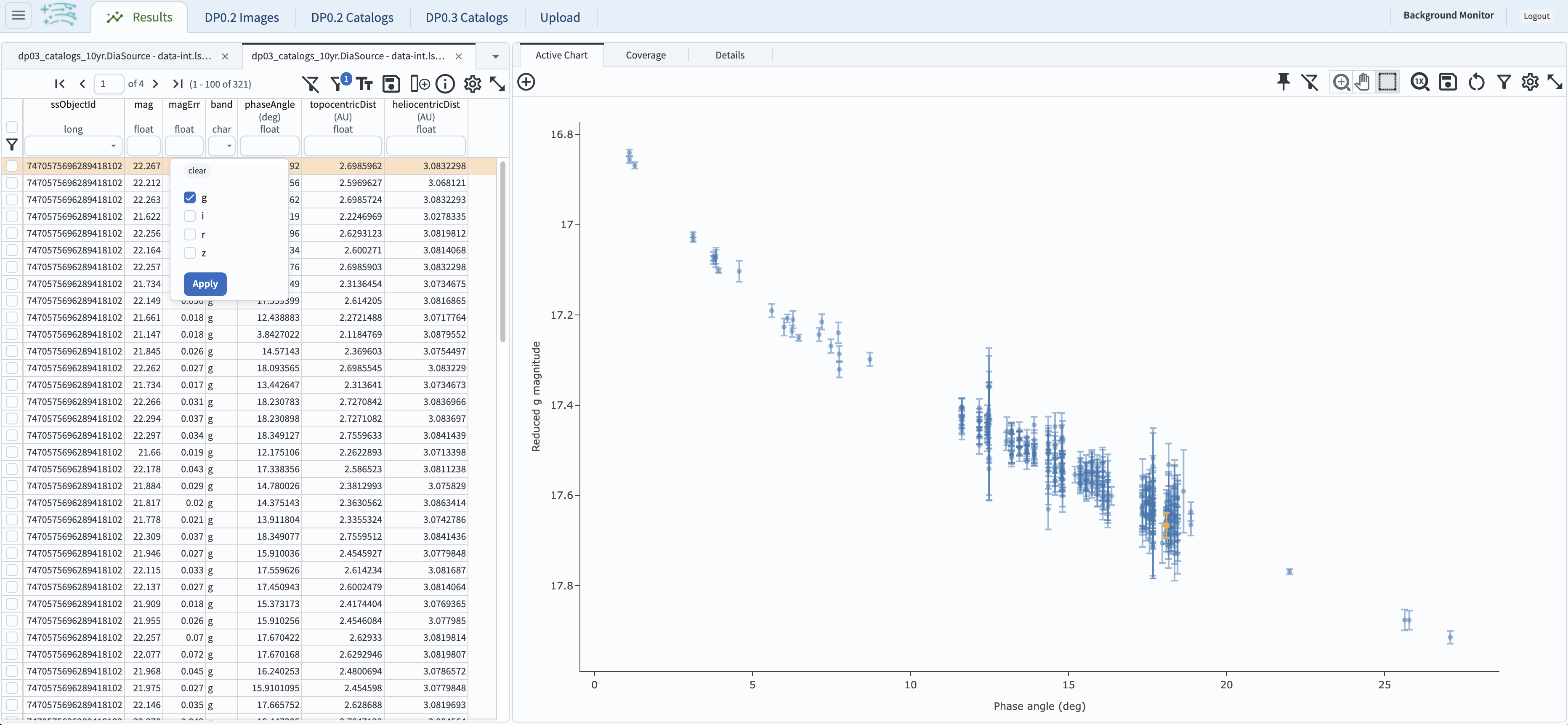
Figure 6: The g-band phase curve for the MBA with ssObjectId = 7470575696289418102.#
2.6. In order to plot a phase curve in a different band, for example in z-band, select the z-band
data by clicking on the down-arrow in the box underneath the table heading band.
Check the box by the “z” entry and un-check the “g” entry.
The g-band phase curve plot will be replaced with the z-band phase curve plot as shown below.
It is clear that the phase curves of the source are offset from each other in these two filters, reflecting the variation in brightness
of asteroids in different filters. Also the reduced magnitude qualities (i.e., photometric uncertainties) are significantly different.
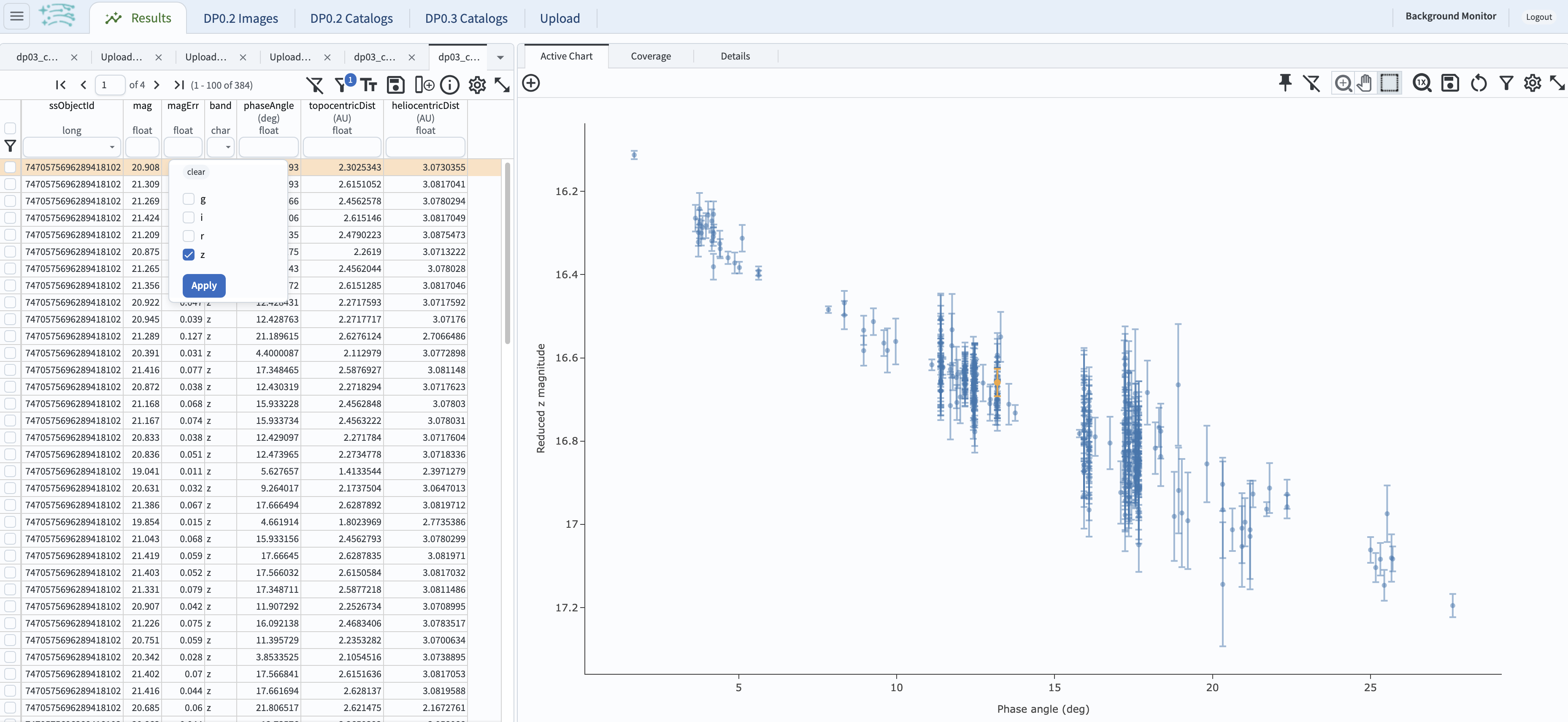
Figure 7: Same as Figure 6, but in z-band.#
Step 3. Exploring phase curve data products from the DP0.3 catalogs#
3.1. This section explores the distribution of G12 slope parameter values as a function of absolute magnitudes
H for MBAs in griz bands. Return to the originally retrieved table in Step 1.2 by clicking the first table tab
(if you closed that tab, reissue the ADQL search from Step 1.2).
Remove the numObs > 2000 condition either by clicking the remove filter icon on the top right or by deleting the
condition and hitting the return key. Then, add a new chart by clicking the “+” button above the plot panel
choose “Add New Chart”, opt for “Heatmap” as the “Plot Type”, and create a new plot for the G12 vs. H in g band,
adhering to the specified plot settings below.
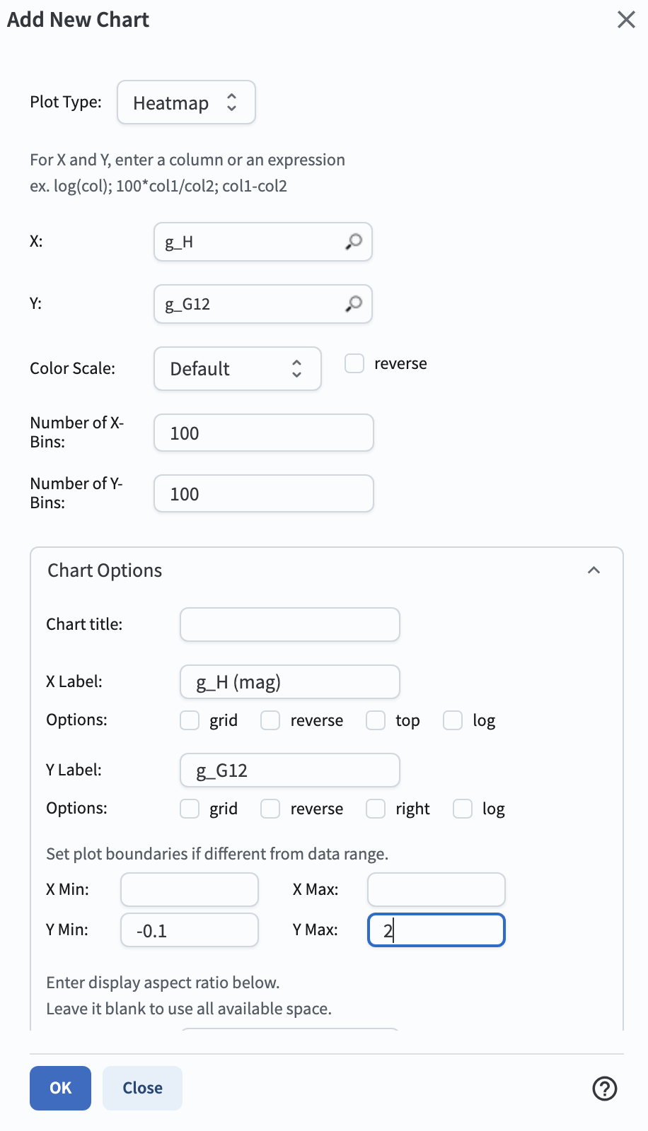
Figure 8: The plot parameters in the “Add New Chart” pop-up window to plot the G12 vs. H in g band.#
3.2. Once you’ve created the G12 vs. H plot for g-band, add three more new plots for riz bands by repeating the
creation of the G12 vs. H plot in Step 3.1, but going through the riz bands. This will generate four panels as shown below.
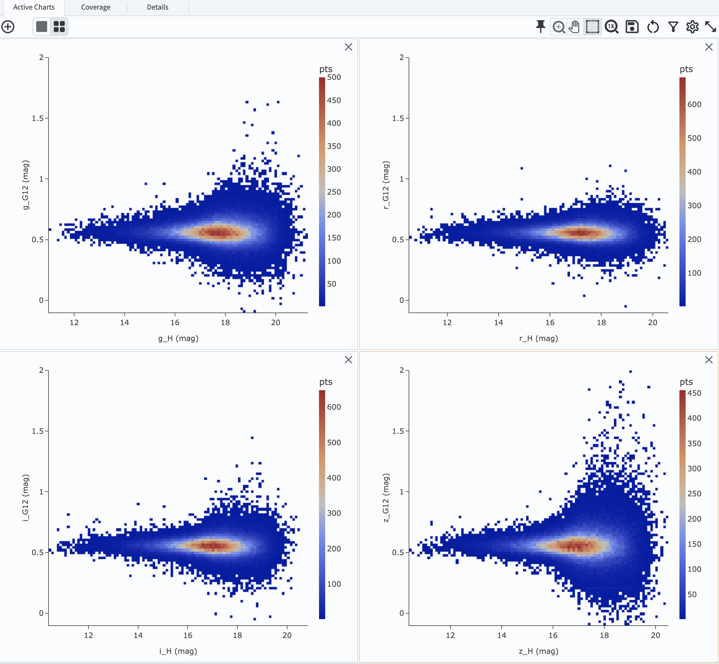
Figure 9: The G12 vs. H plots in griz from top left to bottom right clockwise.#
3.3. Recall that the input (truth) G value using the HG_model that was used to generate the DP0.3 simulated object’s
observed properties was fixed across the population to a constant value of G = 0.15 (refer
The DP0.3 Simulation). The DP0.3 automated phase curve
fitting (which uses HG12_model) produces a nearly constant value for G12 with a relatively small spread at bright magnitudes,
and the scatter in measured G12 starts to deviate more substantially at fainter magnitudes where it is likely harder to recover
the intrinsic value.
3.4. This section explores the impact of the total number of observations for a given source (numObs) and
the perihelion distance (q) on the quality of phase curve fitting in i-band as an example. First close any open plots except
for one heatmap, and then click on “Chart options and tools” icon (single gear)to make a new plot. Select “Modify Trace”, set the “X”
to numObs, “Y” to i_Herr, the number of “X”- and “Y”-bins to 200. Lastly, set the min and max for the y-axis under the
“Chart Options” to be 0 and 0.05 as follows. Make another plot by repeating the same paramter setting, by clicking on the “+” button, and this time
and entering q on the x-axis.
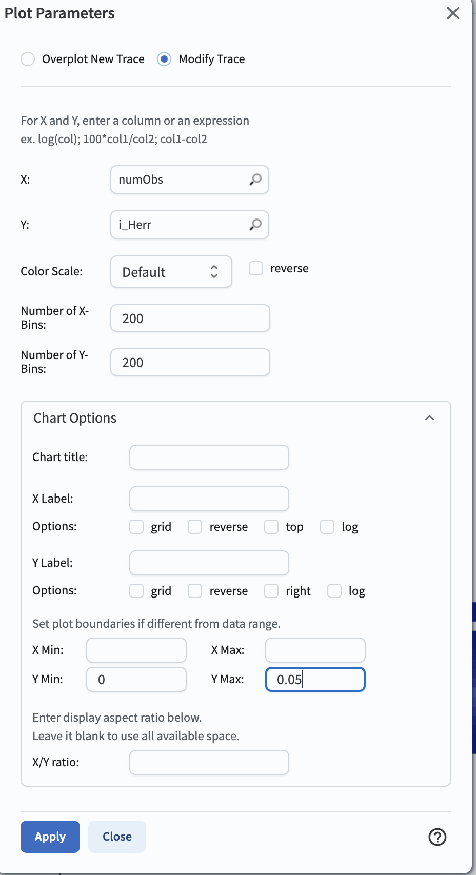
Figure 10: The “Plot Parameters” pop-up window to plot the i_Herr vs. numObs.#
3.5. Make two new plots by repeating the above, but setting the “Y” to i_G12err. This time,
set the min and max for the y-axis under the “Chart Options” to be 0 and 0.5. This will generate four panels showing
how the H and G12 parameter uncertainties vary with the total number of observations and the perihelion distance for MBAs.
In left panels, it is clear that the phase curve fit uncertainties decrease with the number of observations of each source.
So as LSST accumulates data over time, precision in the phase curve modeling will improve. The right panels show that uncertainties
in the phase curve parameters modestly increase for objects with larger perihelion distances.
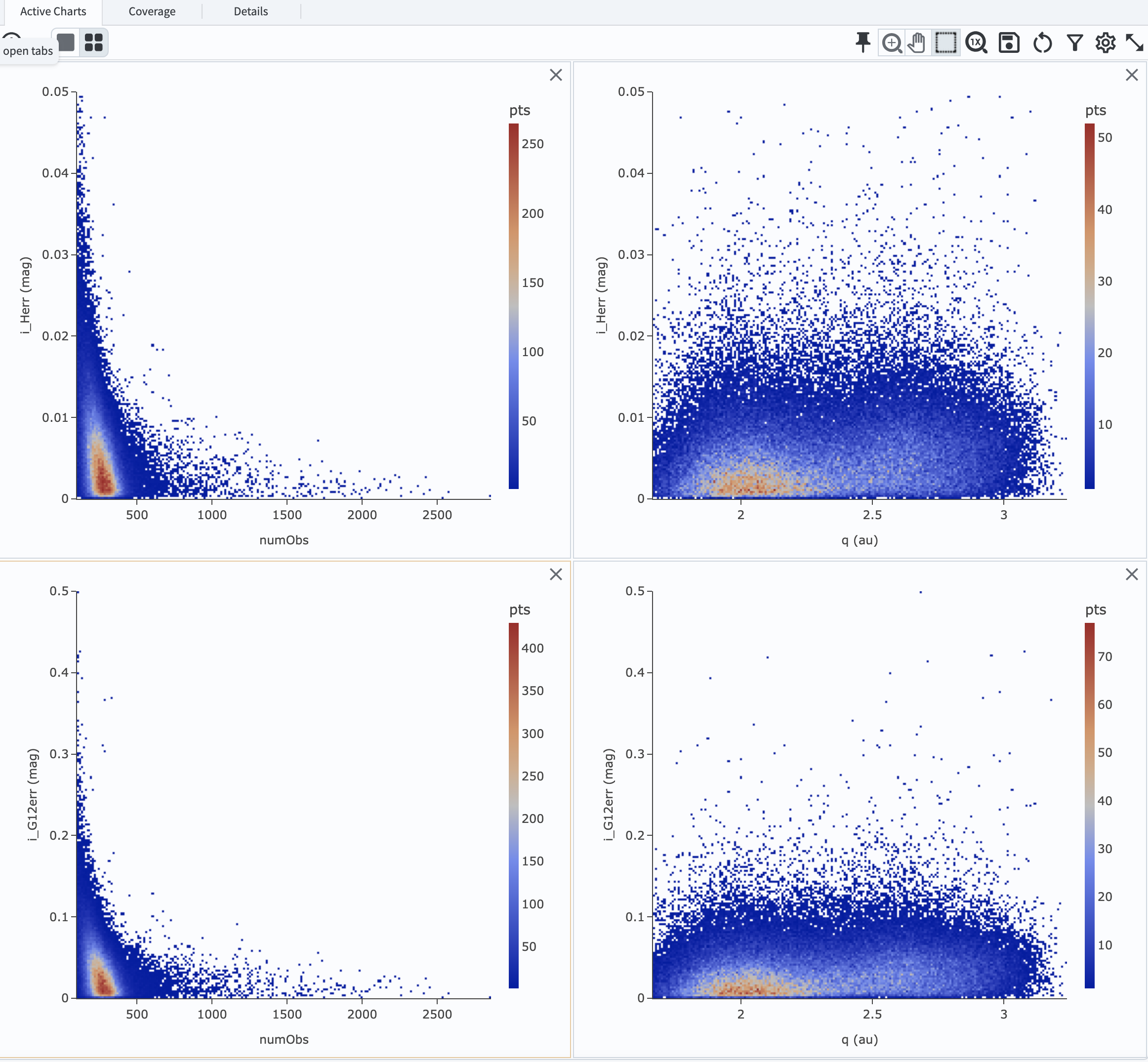
Figure 11: Uncertainties in i_Herr and i_G12err as a function of the total number of observations and the perihelion distance.#
3.6. The above plots compare numObs (total in all bands) with model fits, which may not be the ideal metric since the quality
of phase curves can vary quite a bit between filters. Instead, one can look at the number of datapoints included in the phase curve
modeling on a per filter basis (e.g., r_Ndata for the r-band in the SSObject table). To make a plot showing the distribution of
the number of observations in each filter, again first close any open plots except for one, and then click on the “+” icon to add a chart.
In the “Add New Chart” pop-up window, set the “Plot Type” to “Histogram”, the “Column or expression” to g_Ndata. Select the “Uniform binning” algorithm,
set the number of bins to 100 with the min and max to be 0 and 1300, respectively. Under the “Chart Options”, check the “log” box for the y-axis.
It will plot the histogram of the g-band number of observations. Once creating the g_Ndata histogram, close the remaining plot from
Step 3.5. To overplot the histogram for r_Ndata, select “Overplot New Trace” on the “Plot Parameters” pop-up window, and use the same
plot parameters, but change the “Column or expression” to r_Ndata. Now the “Name” box under the “Trace Options” will appear, where you can
set legend for each histogram. Once overplotting the r_Ndata histogram, the “Choose Trace” field with a drop-down menu becomes available
when you reopen the “Plot Parameters” pop-up window. Choose “Trace 0” and enter a label for the g_Ndata histogram in the “Name” box under the
“Trace Options”. Repeat this process for the i and z bands as well. For the z band plot, set the “X Label” to “Number of observations”.
Note that r- and i-bands produce the most data points for recovering phase curves, while g- and z-band produce much less. Phase curves
measured in r- and i-bands will thus be better sampled. Clicking the labels in the legend makes it possible to show and hide each histogram.
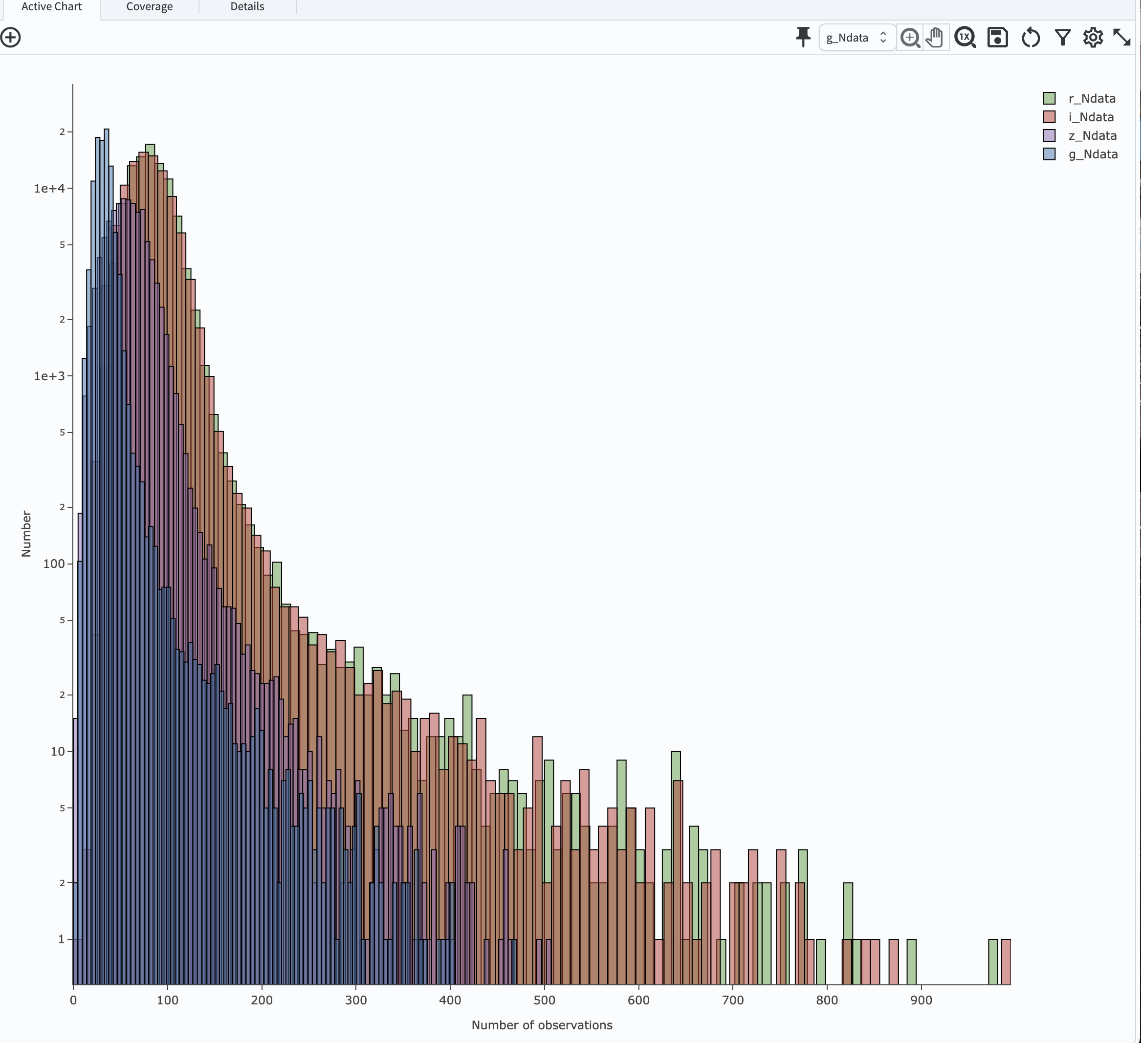
Figure 12: Histograms of the number of observations in each filter.#
3.7. To confirm whether phase curve fitting in i band is indeed more precise than in z band, let’s compare the uncertainty
in H values for i and z bands by adding a new plot. Add a new chart by clicking the “+” on the upper left” and select “Heatamp”. Set the “X”
to i_Herr and “Y” to z_Herr with the X and Y MIN/MAX of 0 and 0.1. To make the plot with a more proper display ratio, slide the
dividing line between the table and the charts to reduce the size of the table panel. In the right panel in the “Active Charts” panel below,
one can see that poorer sampling drives higher uncertainty in the derived absolute magnitude H using z band compared to i band for MBAs.
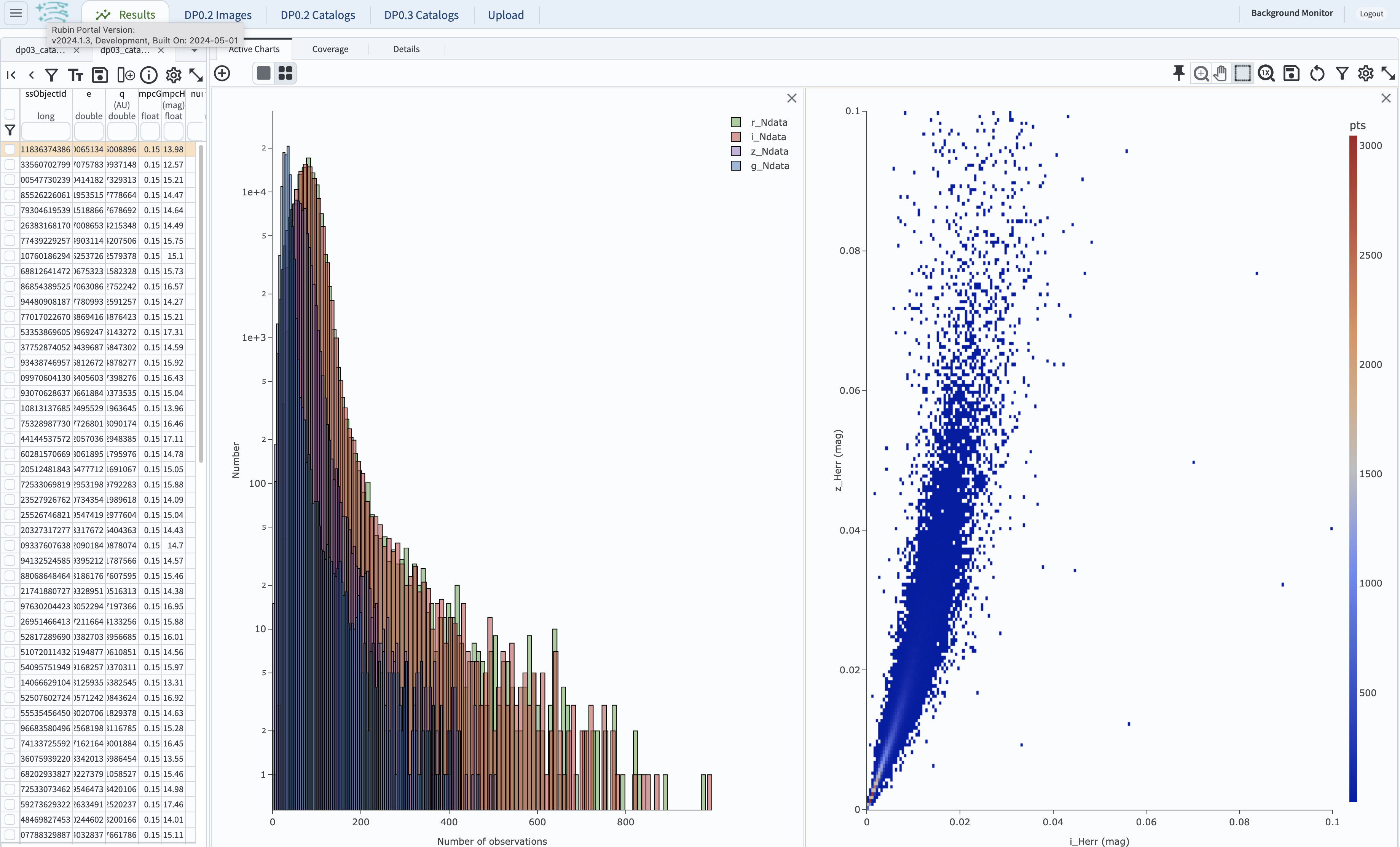
Figure 13: Comparison of the uncertainty in the measured H values in i and z bands.#
Step 4. Exercises for the learner#
4.1 Explore phase curves for objects with less phase angle coverage (e.g., Trans-Neptunian Objecs or Jupiter Trojans) and compare them with those for MBAs.